Beacon’s AI Supply Chain Workspace turns fragmented data into intelligent supply chains - focusing on reducing unnecessary spend across the supply chain.
Introducing the Executive Overview Dashboard
Most supply chain leaders we speak to don't have a data problem. They have a fragmentation problem.
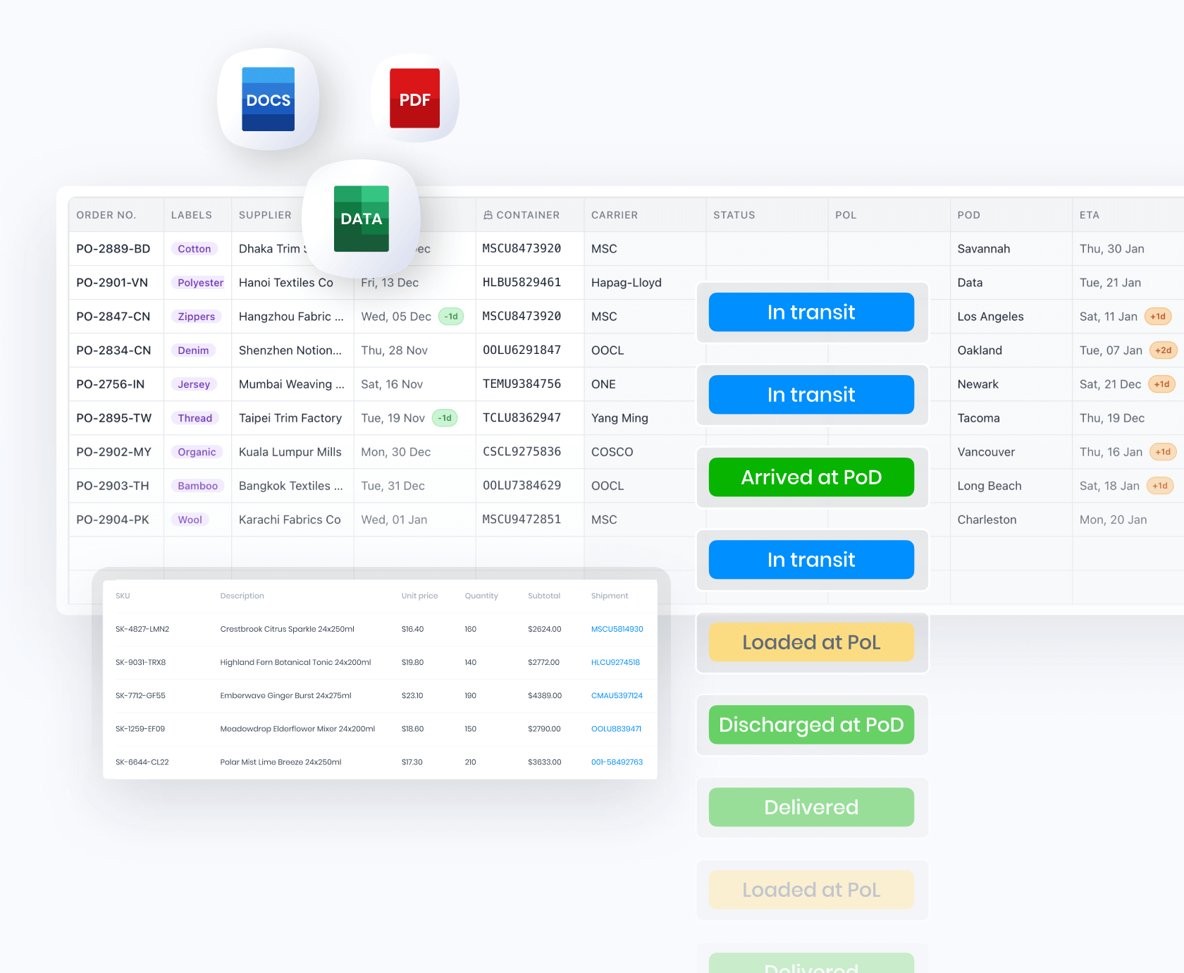
The information they need is already inside the business: carrier feeds, ETAs, on-quay times, transit performance, invoices, exception logs. It's just scattered across portals, emails, ERP exports and a handful of spreadsheets that nobody really trusts.
That fragmentation is what slows everything down. Routine questions about how the network is performing turn into a multi-day aggregation exercise. D&D charges land before anyone has had a chance to prevent them. Safety stock buffers get padded because nobody fully trusts the data. Reports that should take seconds take days.
Today we're releasing Beacon's new Executive Overview Dashboard: a single executive view of your operations, built to answer two questions at a glance: how is it performing right now, and why?
How your operation is performing right now
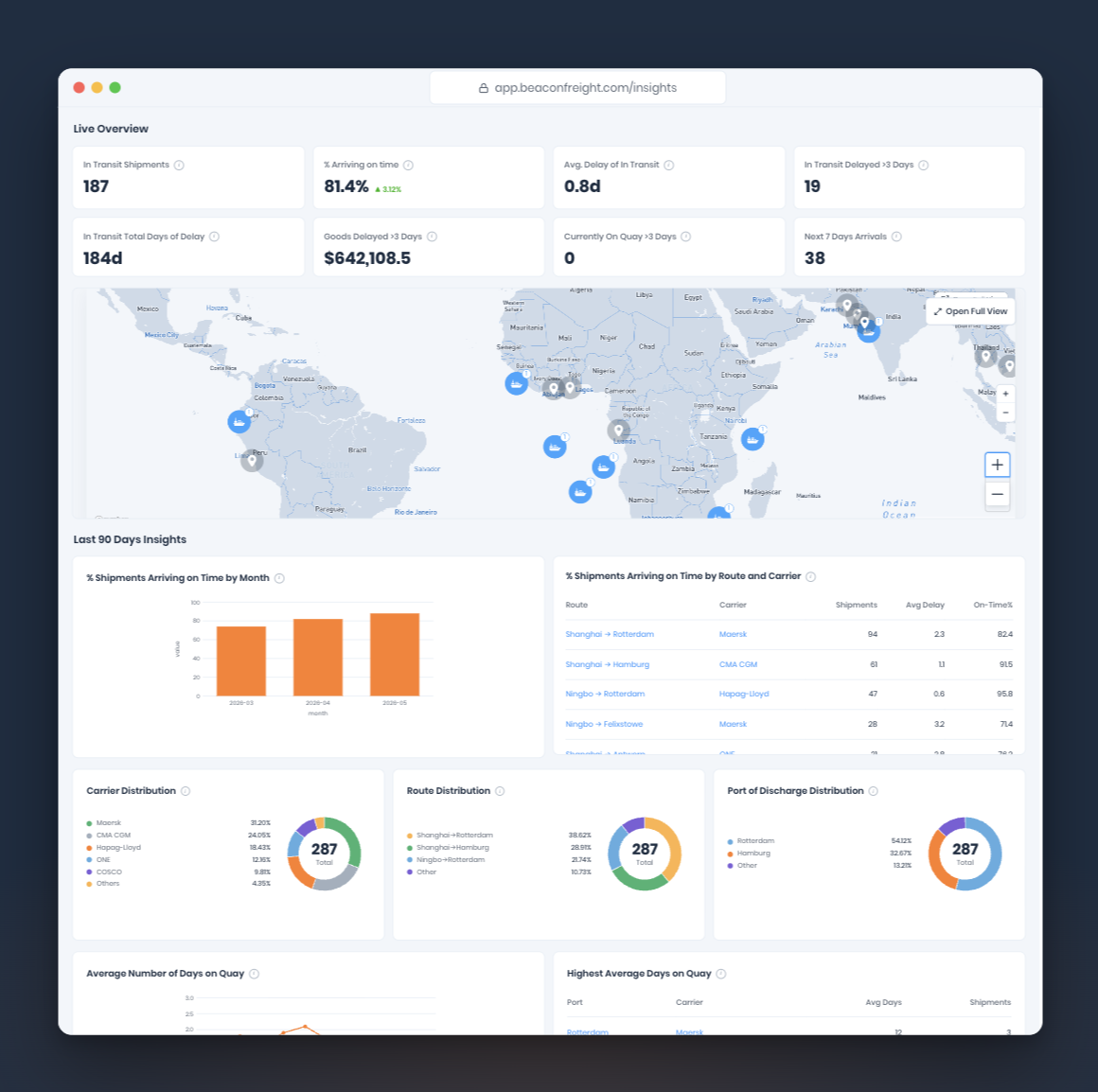
The top of the Executive Overview Dashboard gives you a continuously refreshed operating picture.
A row of summary KPIs covers active shipments at a glance: how many are in transit, what percentage are arriving on time, what is sitting on quay and costing you in demurrage charges, how many are running more than three days late, and the total days of delay sitting in the network. Alongside, the commercial picture: the value of goods delayed by more than three days, and what's landing in the next seven days.
Beneath the KPIs, a real-time world map shows every in-transit shipment, so you can see where everything is.
The summary gives you a clear indication of where you are leaking cash in your supply chain; due to late stock on the water when it should have arrived or unnecasary D&D charges.

Why it's happening
The lower half of the Executive Overview Dashboard is where you go from what's happening to why.
A network reliability trend shows on-time arrival rate over time, so you can tell a temporary disruption apart from a longer-term reliability issue. A route and carrier performance table surfaces the worst-performing combinations, the lanes consistently dragging the average down.
A network concentration view shows your reliance on individual carriers, routes and ports of discharge. It's useful both for routine planning and for understanding where you're exposed.
Transit-time and days-on-quay trends fill in the rest of the picture, separating transit issues from port issues, and flagging ports where dwell time is climbing before it shows up as demurrage and detention.

Why we built this
We built the dashboard around a simple belief: visibility is an input to achieving an intelligent supply chain.
Knowing where a container is has never been the hard part. The hard part is turning thousands of fragmented data points into a coherent view of how your supply chain is performing and where it's vulnerable.
If you're already a Beacon customer, the new Executive Overview Dashboard is live in your workspace today. If you're not, we'd be glad to show you what your network looks like inside it.
Where this goes next
The pressures and priorities supply chain leaders work under don't stand still. Disruption keeps changing shape. Leadership keeps asking new questions. The metrics that matter shift quarter to quarter, and the answers that worked last year aren't the answers that will work this year.
The Executive Overview Dashboard is built to move with that. We'll be developing it at a rapid pace from here, with new modules, sharper diagnostics, and deeper connections to the rest of your data, all shaped directly by what our customers are dealing with right now.

Beacon Insider: June
Beacon Insider: February